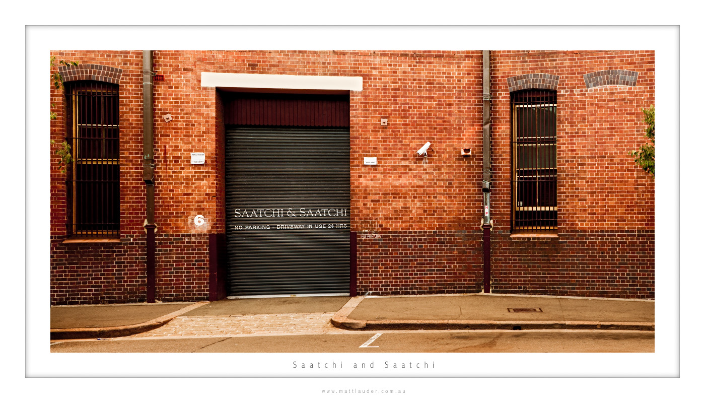
I have gone to this spot numerous times over the past year before teaching my Sydney courses to see if I can get a shot worth publishing but being in the heart of Sydney there are always parked cars in critical areas and this image is no exception.
On arrival I was stunned that the area was free and just as I set up two cars parked both left and right of the frame totally killing the perfect composition so I was forced to crop the shot in a 2:1 ratio where a 3:1 would be perfect. But this is a preview of how I see this shot and I am determined to get the angle I want, it is just going to take time.






pretty cool, what is this place anyways?
Mitch it is a upper market clothing company.
I’d hate to be a goody-two-shoes but Saatchi and Saatchi is a global advertising agency!
Nice work Matt – I’m always interested in looking at what can seem as mundane or normal things in a new light. Here, I think you’ve done it well. Whilst its not my favourite shot of yours (give me some beach any day!!), I really do like the texture in the bricks and the well balanced exposure.
It looks real,but I don’t know what the “meanings” behind this image.
Hi Diana… I don’t think all photos have to have some big meaning behind them. I just like the composition.
Stunning, cars are a big problem when shooting in Sydney. That Palisade Hotel Image of mine used to contain a whole green Toyota Corolla against the limestone wall. It was interesting getting rid of it but at least it was simple limestone. Now, brick, that’s something else again. I think it could be done, days maybe involved though!
Thanks Matt… yea getting shots like this in Sydney can proove to be more a skill in patience than actually taking them.
Oh I nearly forgot:
http://saatchidesign.com.au/
🙂